Editor(beta)
Page Introduction
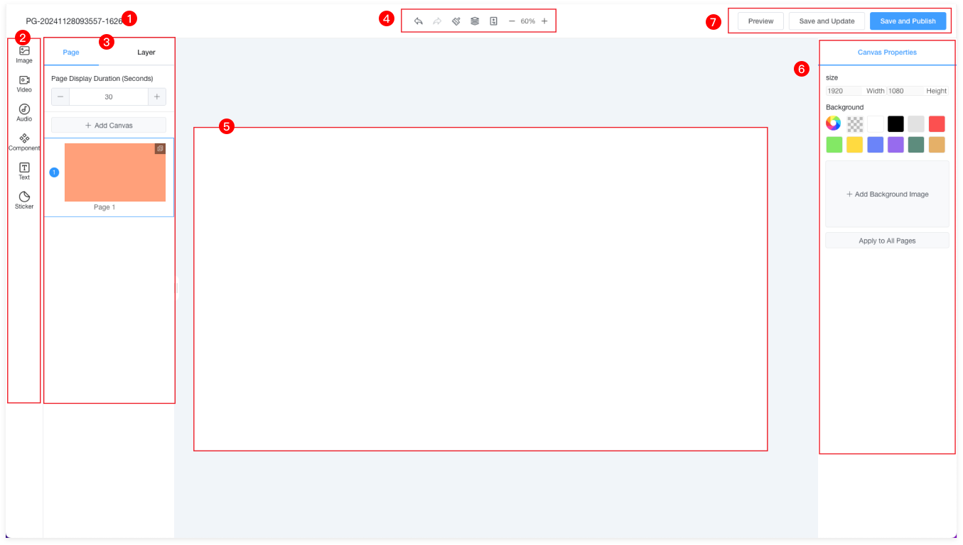
| 1 | Program name, double-click to edit the name. |
| 2 | Editor main menu: Images, Videos, Music, Components, Text, Screen Stickers, Queue Calling. |
| 3 | Submenu items of the main menu can be dragged onto the canvas. |
| 4 |  Undo: Reverts the last action to restore the previous state. Undo: Reverts the last action to restore the previous state. |
 Redo: Re-executes the last undone action. Redo: Re-executes the last undone action. |
 Clear: Clears all content on the page. Clear: Clears all content on the page. |
 Layers: View the hierarchical relationship of each element. Layers: View the hierarchical relationship of each element. |
 Pages: Add multiple pages and set the duration for each page. Pages: Add multiple pages and set the duration for each page. |
| Zoom: Zoom in or out on the canvas size using the mouse scroll wheel. |
| Drag: Hold Alt + Left mouse button to drag the canvas. |
| 5 | Canvas: The content editor section. You can view or edit the elements added here. |
| 6 | Properties: Edit properties for different elements here. |
| 7 | Save Only: Save the program to the program list; Save and Update: This program will be updated on the published devices; Save and Publish: This program will be saved to the program list and published to the program release page. |
Images
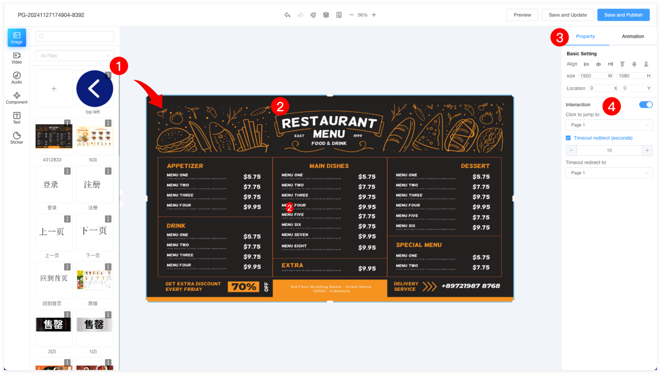
| 1 | Materials can be searched by name or filtered by folder. Files can also be uploaded or deleted. Select the desired image and drag it to any position on the canvas. |
| Note: Images that fail AI review cannot be dragged onto the canvas. |
| 2 | To resize the selected material, drag the box at the bottom-right corner to scale the image proportionally. |
| 3 | The right property panel allows you to adjust the material's position, width, and height. |
| 4 | Interaction: By default, the button is off. When enabled, clicking the image will redirect to an internal page. |
| Timeout Redirect: Default is off. When enabled, if the image is not clicked within the set time, it will redirect to the timeout page. The timeout page is also set in the internal page settings. |
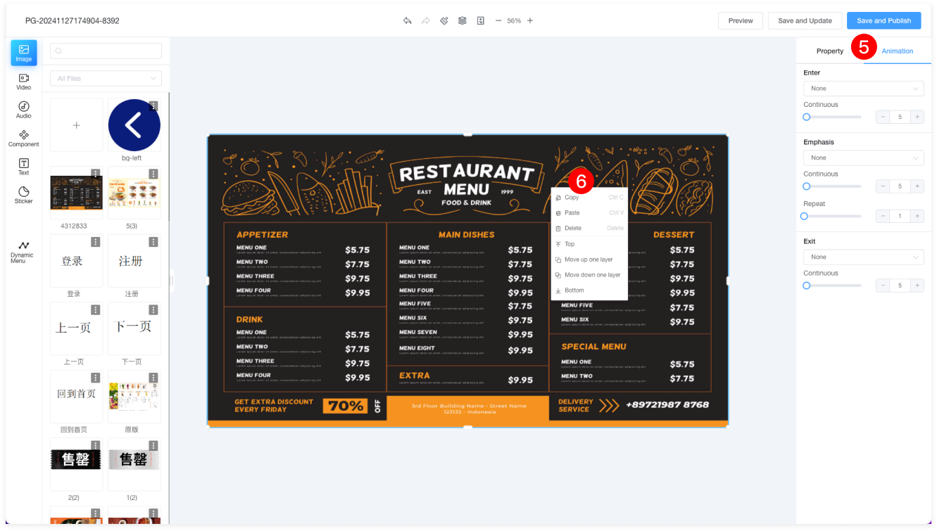
| 5 | Entrance Animations: Move in from the left, right, up, or down. |
| Duration: Set the duration of the animation. |
| Emphasis: Zoom, shrink, shake, or rotate. |
| Repeat: Set how many times the animation repeats during the time period. |
| Exit Animations: Move out to the left, right, up, or down. |
| 6 | Right-click on the selected material to copy (Ctrl+C), paste (Ctrl+V), delete (Delete), bring to the front, move up one layer, move down one layer, or send to the bottom. |
Video
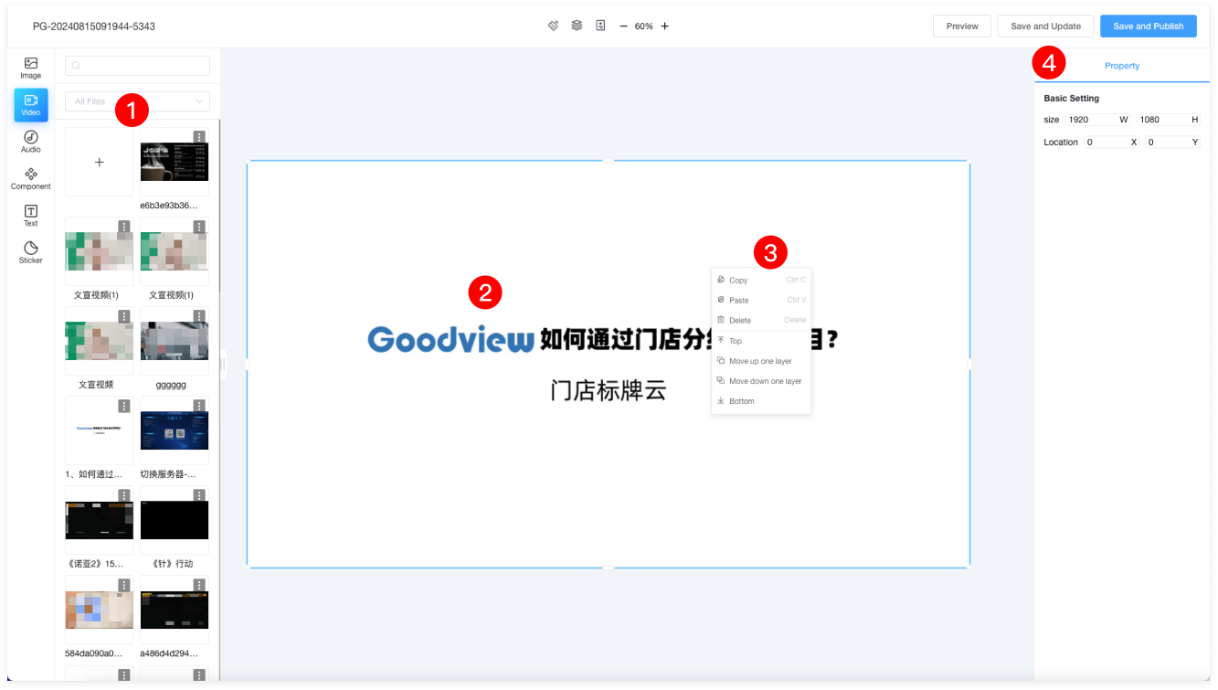
| 1 | Materials can be searched by name or filtered by folder. You can also upload or delete files. Drag the desired image to any position on the canvas. |
| Note: Materials that fail AI review cannot be dragged onto the canvas. |
| 2 | To resize the material proportionally, select the material and drag the box in the bottom-right corner. Double-click on the material to replace it. Only one video material can be added per page. |
| 3 | Right-click on the selected material to copy (Ctrl+C), paste (Ctrl+V), delete (Delete), bring to the top, move up one layer, move down one layer, or send to the bottom. |
| 4 | The properties panel on the right allows you to modify the material's position and width/height. |
Music
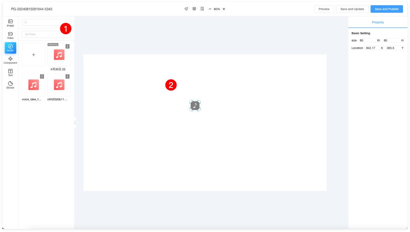
| 1 | Materials can be searched by name or filtered by folder. You can also upload or delete files. Drag the desired image to any position on the canvas. |
| Note: Materials that fail AI review cannot be dragged onto the canvas. |
| 2 | Music can be placed anywhere, and the music icon will not be displayed in the terminal program. Only one music material can be dragged into each page. |
Component
Weather Component
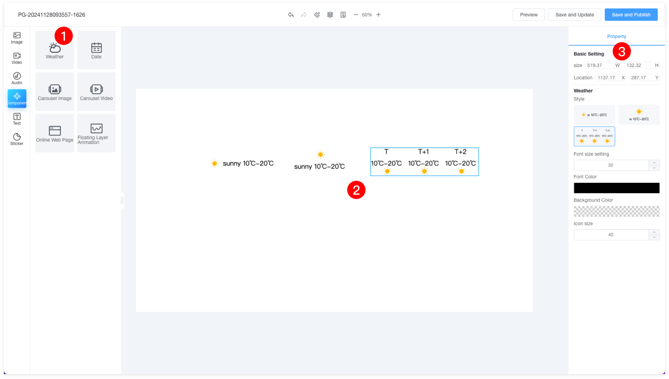
| 1 | Drag the weather component onto the canvas. |
| 2 | There are three styles for the weather component, which can be set in the properties panel on the right. Drag the bottom-right corner of the material to resize the weather component proportionally. |
| 3 | The properties panel on the right allows you to set the weather style, font, background color, and more. |
Time Component
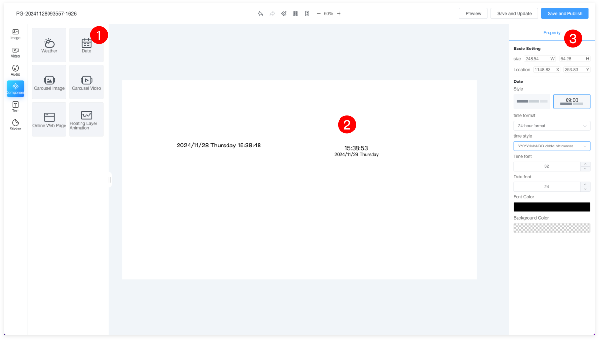
| 1 | Drag the date component onto the canvas. |
| 2 | There are two styles for the date component, which can be set in the properties panel on the right. Drag the bottom-right corner of the material to resize the component proportionally. |
| 3 | The properties panel on the right allows you to set the time style, font size, font color, background color, and more. |
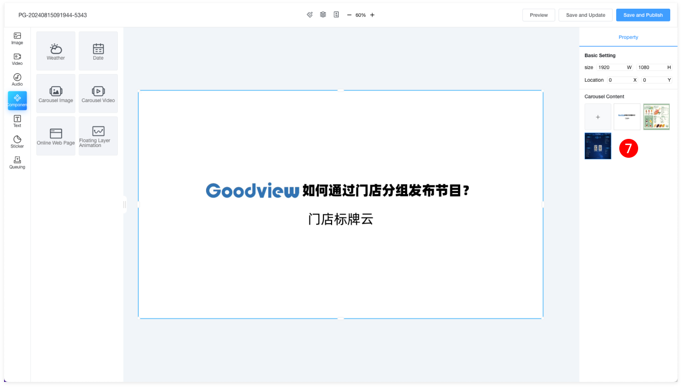
Image Carousel
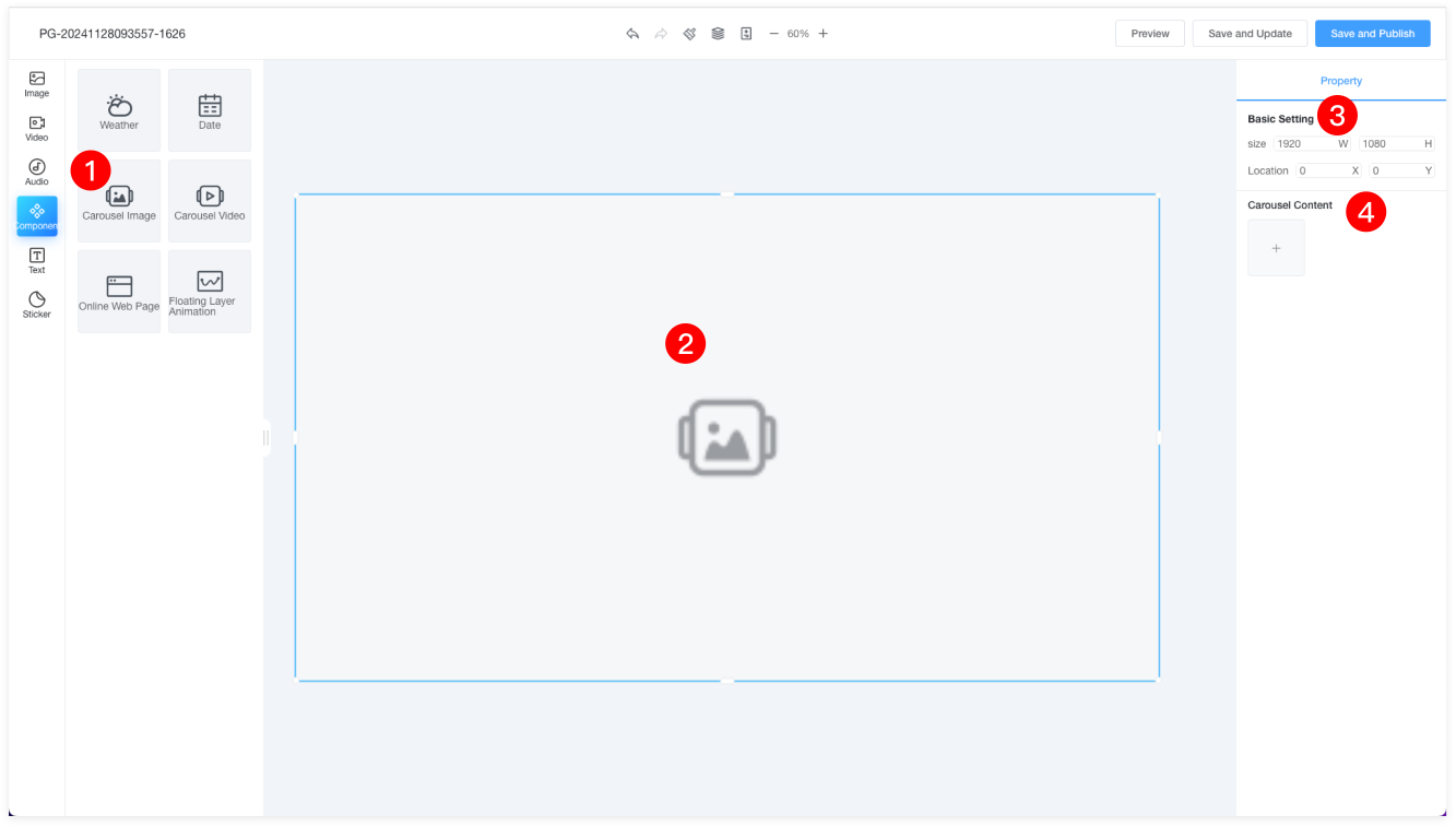
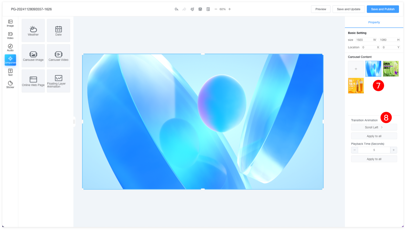
| 1 | Drag the image component onto the canvas. |
| 2 | Drag the bottom-right corner of the material to resize the component proportionally. |
| 3 | The properties panel on the right allows you to set the position, size, and other properties of the image component. |
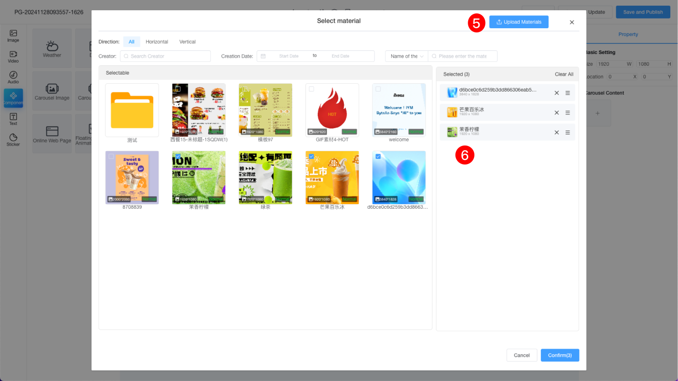
| 4 | Click the plus sign to add multiple images to the carousel. |
| 5 | Click the Upload Material button to upload the images you need. |
| 6 | The selected images can be reordered and deleted. |
| 7 | Here, the selected images are displayed, and you can perform delete operations. |
| 8 | Select a single image to set its transition animation and interval time. Click "Apply to All" to apply the transition animation and timing to all images. |
Video Carousel
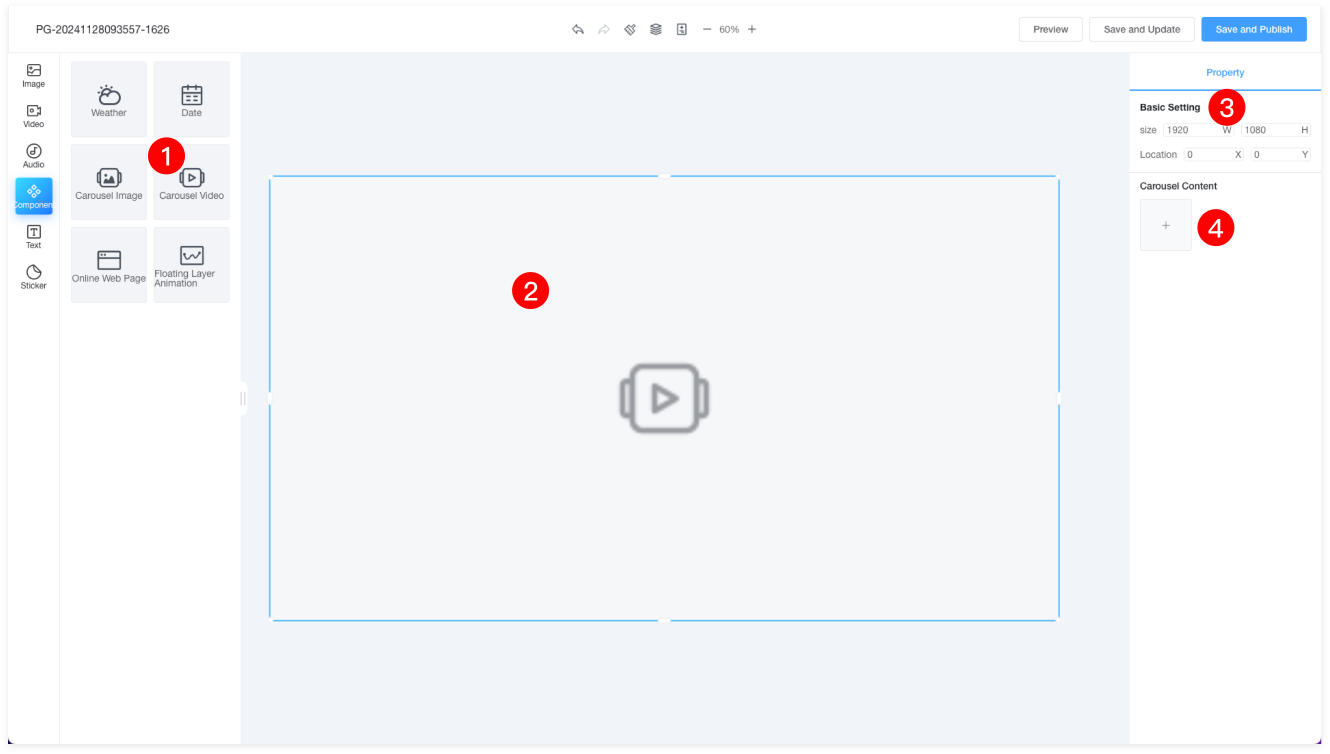
| 1 | Drag the video component onto the canvas. |
| 2 | Drag the bottom-right corner of the material to resize the component proportionally. |
| 3 | The properties panel on the right allows you to set the position, size, and other properties of the video component. |
| 4 | Click the plus sign to add multiple videos or image carousel items. |
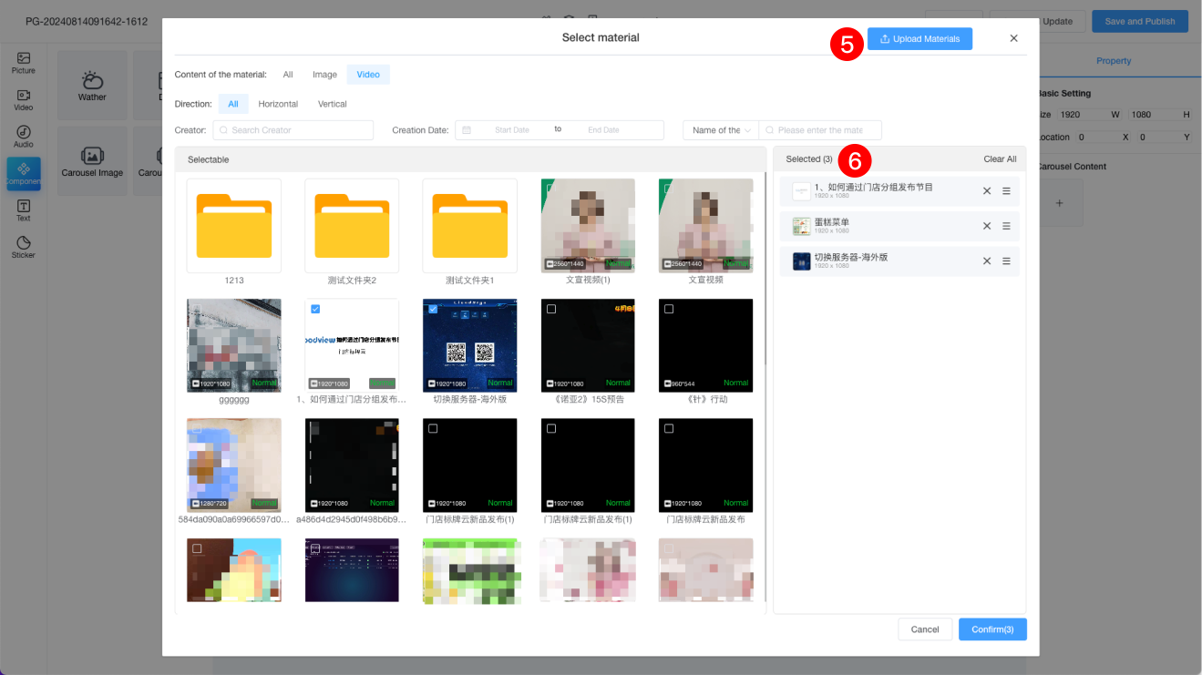
| 5 | Click the Upload Material button to upload the videos or images you need. |
| 6 | The selected videos or images can be reordered and deleted. |
| 7 | Here, the selected videos are displayed, and you can delete them if needed. Videos cannot have transition animations or timing settings. |
Online Webpage
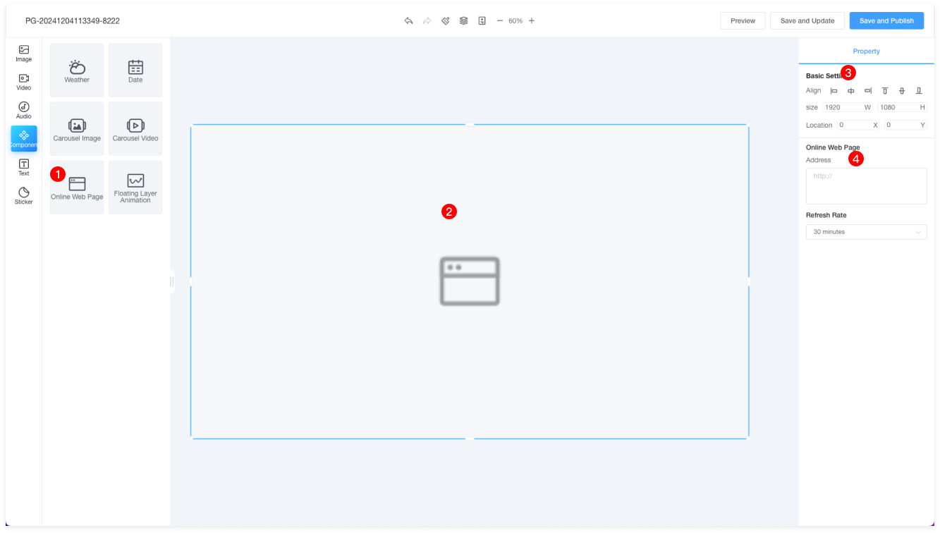
| 1 | Drag the webpage component onto the canvas. Note: Only one webpage component can be added per page. |
| 2 | Drag the bottom-right corner of the component to resize it proportionally. |
| 3 | The properties panel on the right allows you to set the position, size, and other properties of the component. |
| 4 | Enter the URL to set the website's refresh frequency. |
Floating Animation
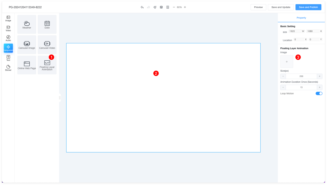
| 1 | Drag the floating animation component onto the canvas. Floating animation refers to an animation that floats on top of the program, randomly moving across the screen. |
| 2 | Floating animations are generally placed at the top of the canvas and cannot be resized. |
| 3 | You can add images (with a maximum size of 1080x1080px) and set the animation's motion duration. It is recommended to set the duration to 15 seconds. |
Text
Basic Text
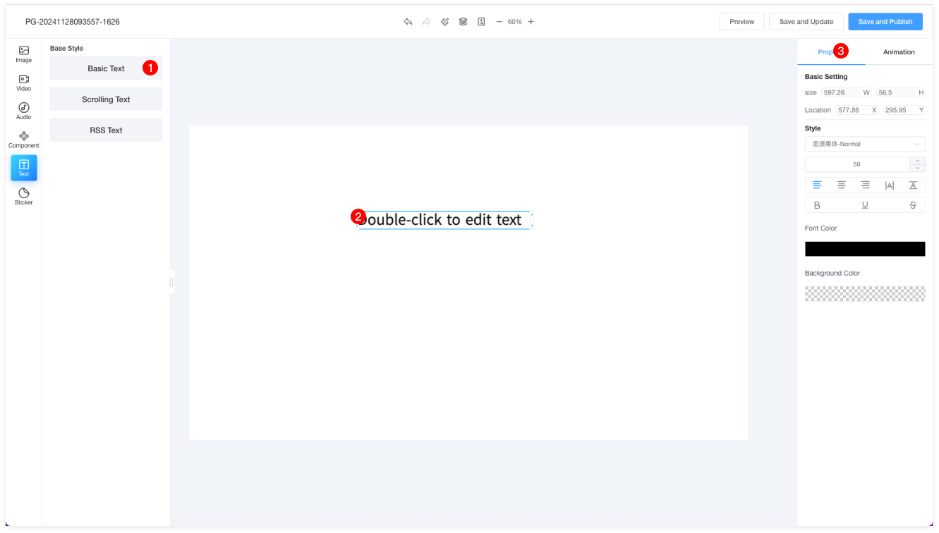
| 1 | Text styles are divided into Basic Text and RSS Text. Basic Text refers to regular text. |
| 2 | Double-click to edit the text content. Right-click to perform copy, paste, delete, bring to the top, move up, move down, or send to the bottom. |
| 3 | The properties panel allows you to adjust the text size, position, color, font, font size, alignment, letter spacing, line spacing, background color, and more. |
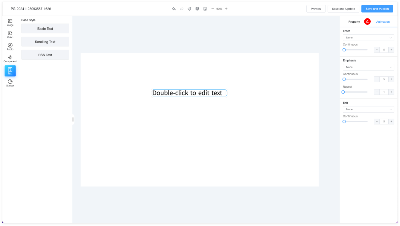
| 4 | Entrance: Slide in from the left, right, top, or bottom. |
| Duration: Set the duration of the animation. |
| Emphasis: Options to enlarge, shrink, shake, or rotate. |
| Repeat: Set how many times the animation repeats within a specified time. |
| Exit: Slide out to the left, right, top, or bottom. |
Scrolling Text
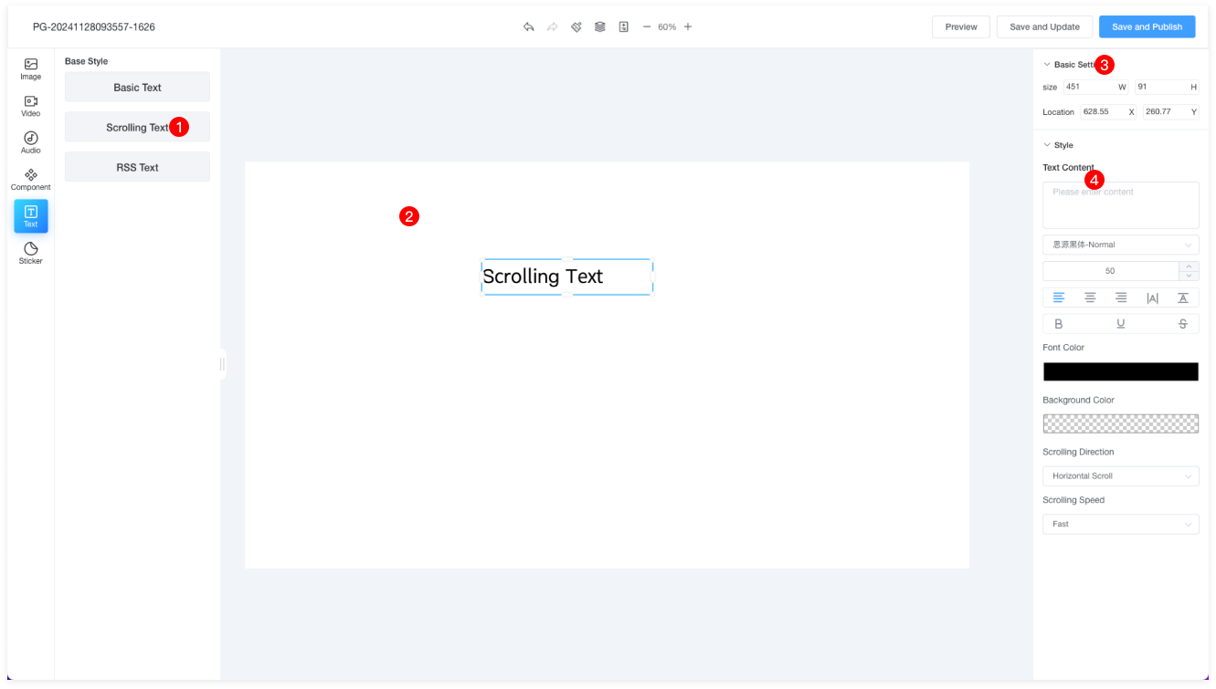
| 1 | Drag the scrolling text component onto the canvas. |
| 2 | This area displays the reminder text, which cannot be modified. You need to enter the scrolling text content on the right side. Previews are not available, but the final effect can be viewed on the terminal. You can drag the text length to set the scrolling area. |
| 3 | Basic settings allow you to adjust the text size and position. |
| 4 | Text content: Enter the content for the scrolling text. |
| Text: You can set the font, font size, alignment, letter spacing, line spacing, bold, underline, strikethrough, font color, background color, and more. |
| Scroll Direction: Horizontal scroll or vertical scroll. |
| Scroll Speed: Fast, medium, or slow. |
| Refresh Frequency: 30 minutes, 1 hour, or 2 hours. |
RSS Text
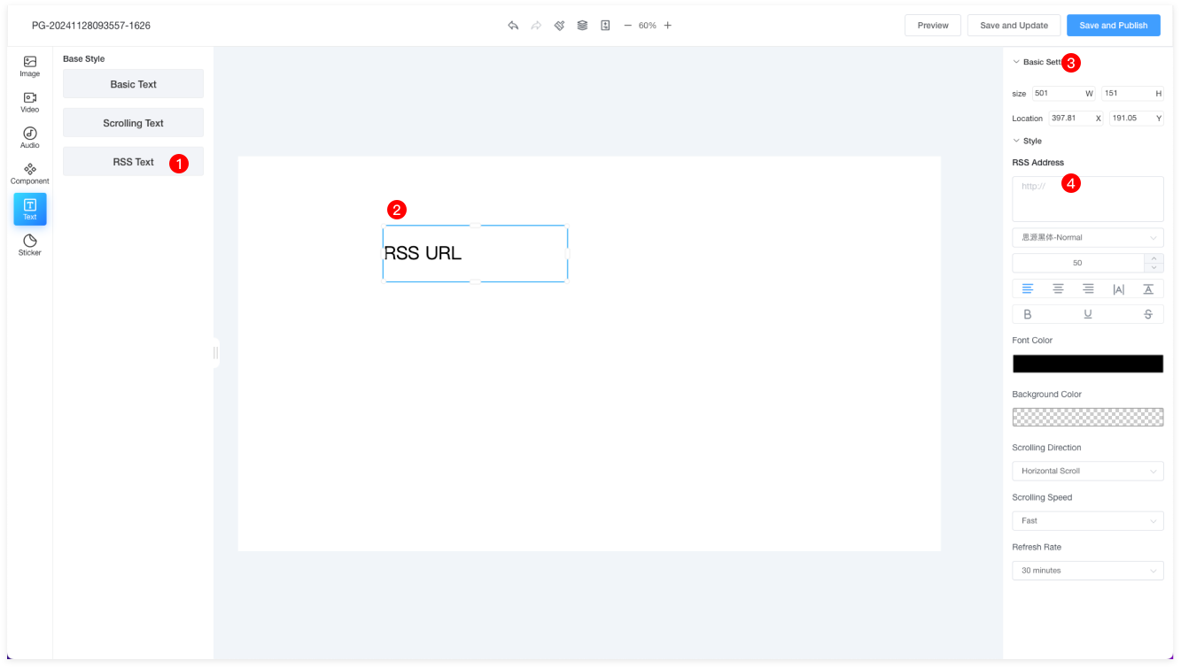
| 1 | Drag the RSS text component onto the canvas. |
| 2 | This area displays the reminder text, which cannot be modified. You need to enter the RSS feed URL on the right side. Previews are not available, but the final effect can be viewed on the terminal. You can drag the text length to set the scrolling area. |
| 3 | Basic settings allow you to adjust the text size and position. |
| 4 | RSS URL: Enter the RSS feed URL. |
| Text: You can set the font, font size, alignment, letter spacing, line spacing, bold, underline, strikethrough, font color, background color, and more. |
| Scroll Direction: Horizontal scroll or vertical scroll. |
| Scroll Speed: Fast, medium, or slow. |
| Refresh Frequency: 30 minutes, 1 hour, or 2 hours. |
Screen Sticker
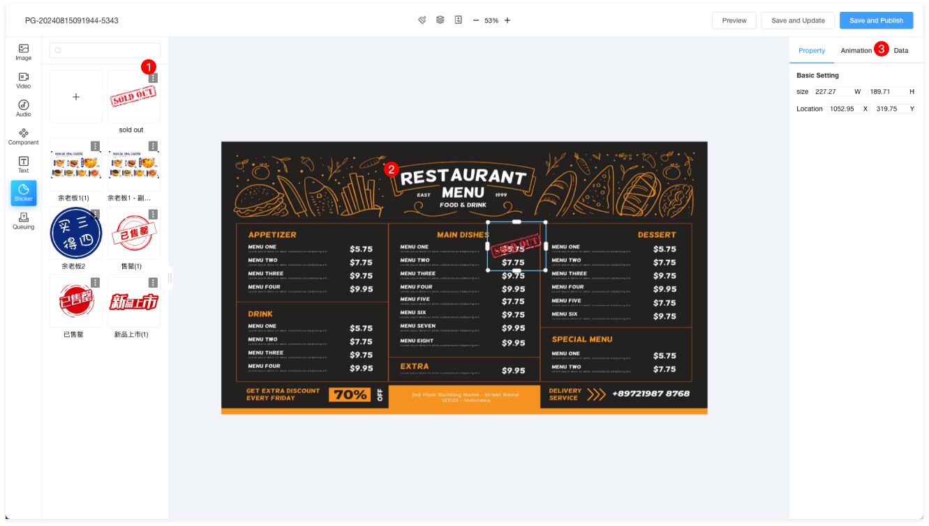
| 1 | Screen stickers are typically used for displaying out-of-stock data binding. The labels come from materials uploaded to the "Screen Sticker" folder in the material list. |
| 2 | Move the out-of-stock label to the appropriate position, and the bottom-right corner can be proportionally resized. |
| 4 | Select Store: Choose the store for which you want to create the out-of-stock label. |
| Binding Type: Out-of-stock label. |
| Element Binding: Click "Bind" to open a prompt for selecting the element to bind. Once the binding is complete, the data label will have a blue border, which only serves to distinguish between bound and unbound data. The terminal display will use the style of the label itself. |